Karl Williams
on 13 February 2019
As part of the ongoing project to upgrade all of our websites to use our Vanilla Framework, we tackled releases.ubuntu.com, a website that lists all Ubuntu releases available for download.

Our design and build process
Identify page types
The first step in the design process was identifying how many pages needed to be updated and the general scope of the project.
We conducted a technical investigation, aided by the engineering team who maintain the project, and identified how the site works and to what extent we could modify the codebase.
The releases pages are unusual in that they are not generated by a web framework or served as static HTML files like most of the websites we maintain. The ability to reliably download Ubuntu being of utmost importance to our users, these pages are served directly by the Apache web server’s Directory Listings feature. The limitation this imposes is that we are only able to configure the header and footer templates used by Apache and have little control over the file listing table’s HTML.
These header and footer templates are generated by a script, when a directory of install images are created by a new Ubuntu release. This script contains logic that appends page elements relevant to the specific release. For example, links to specific installation guides.
The project also has no facility to compile Sass during builds, so we were limited to using the pre-compiled, hosted CSS file. This means that including and extending the default Vanilla behaviour must be achieved in CSS rather than Sass. We wanted to keep this practice to a minimum because overriding the framework features without Sass can lead to more overly-specific CSS rules and adds to maintenance overheads. Keeping local changes to a minimum can allow an upgrade to be as simple as swapping out the URL to the compiled CSS to the latest release.
<style type="text/css" media="screen">
  @import url(https://assets.ubuntu.com/v1/vanilla-framework-version-1.8.0.min.css);
  .p-table-wrapper {
    overflow-x: scroll;
  }
  /* ... local customisation ... */
</style>
Despite no two release pages being exactly the same, they fall into two core categories: the homepage – which has signposts to the other pages – and individual release listings, e.g. for Cosmic Cuttlefish.

Apply Vanilla Framework
We tackled the homepage first, applying the compiled Vanilla stylesheet to the existing HTML and adding classes for the base components. As a first pass, it greatly improved the appearance of content on the page.
When applying Vanilla to a page, we first find logical ways of organising the content into strips – the base-level building block of any Vanilla page layout – and then further subdivide the strips into rows and columns as needed.
With the basic structure defined, we can then style the existing HTML elements with pattern classes. In this case, we applied the list and table patterns to the <ul> and <table> elements
Following this process, we were able to reorganise the content into sections, define a structured layout and improve the flow of the page.
Homepage pre- and post-Vanilla:

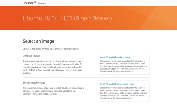
Release page pre- and post-Vanilla:

Design iteration and using Vanilla components
The “first-pass” versions of the pages were then used by the design team as a basis to explore visual improvements.
The design team produced design mockups, focusing on::
- Updating the branding
- Applying clearer layouts to differentiate sections
- Introducing colour
- Establishing a typographic hierarchy
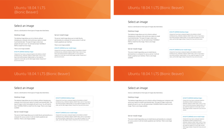
Below are some design explorations using existing Vanilla patterns to help bring content to life on example homepage and release pages.
Homepage explorations:

Releases explorations:

The design team reviewed the proposed mockups and selected the best of both the homepage and the releases pages, but we felt we could further improve the design by:
- Exploring using `heading-four` sized links as signposts in the hero section
- Reworking the layout of the list of Ubuntu flavours
- Removing the visually overwhelming external link pattern
- Applying the card pattern to the highlighted download options, keeping consistent with ubuntu.com’s download section and emphasising the links are direct downloads
Final designs
Taking feedback into consideration we trialled a couple of versions for the Ubuntu flavours section and then came to a final decision for the redesign of both templates.


Final build and release
We then updated the template-generation code to include the patterns required for the latest designs and managed to keep the non-pattern local CSS overrides to a few lines of code (mostly relating to the file listing table).
The final build was then QA’d in various browsers and the changes to the python script were tested and reviewed to ensure that there were no issues with the new code.
The first page to go live was the listing for Ubuntu 18.04.1 LTS and other pages on releases.ubuntu.com will follow soon.


