Lyubomir Popov
on 12 December 2022
Over the years, we’ve identified a number of areas for improvement when it comes to the basic building blocks of a form – inputs, buttons, etc:
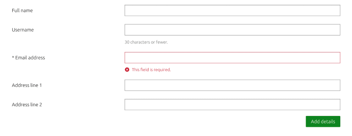
- Long-standing complaints that inputs and buttons are too similar and therefore hard to distinguish
- “Noisiness” of long forms caused by the presence of borders around all sides of inputs and buttons
Last cycle, our proposal for updated form elements was discussed and approved, and in this iteration, we worked on implementing it in Vanilla, our front-end framework.
Before Vanilla 3.9:

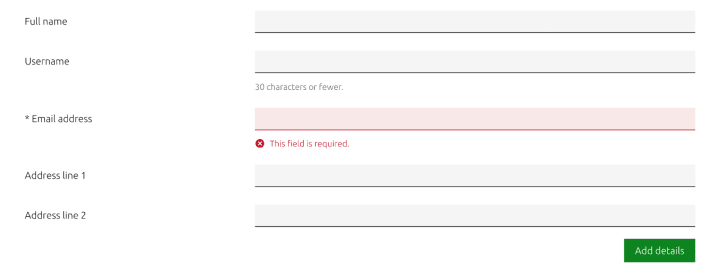
After Vanilla 3.9:

- We’ve reduced the number of borders (all around) to the minimum required to satisfy WCAG contrast ratio requirements for interactive elements
- We’ve removed round corners from buttons and other elements, as part of a wider push to align better with the work of our Brand team
- We’ve introduced subtle transitions when interacting with form elements
This update also affects components that build on the functionality of form elements, like our search and Filter component:

The updated style was released as part of Vanilla 3.9.0 release.
Version 3.9.0 has just been released. You can see the updated form elements in action here


